I did however fall victim to purchasing the 2009 cap for the Arizona Diamondbacks, that cap actually doesn't look that bad with the Diamondbacks logo and colour scheme, but the last two years I can't even shake my 4 inch stick at.
Traditional Dbacks New Era vs. Stars and Stripes Dbacks New Era
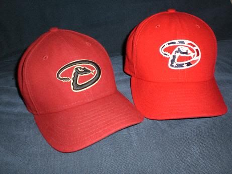
This year however, I think they just look awful.
The good:
Los Angeles Angels
--Simple and works well for the design, plus it matches the original Angels uniforms.

Seattle Mariners
--Look at how awesome that looks, the stitching is fantastic and works well with Seattle's traditional uniforms.

Philadelphia Phillies
--fuckin awesome

The Bad:
Atlanta Braves
--Now look at this, can you really even tell that it is an "A"?

St. Louis Cardinals
--Who cares if it matches? Wtf is that shit on the front?

Chicago White Sox
--The letter "S" with a growth below it. Advert your eyes children!

The Ugly:
Toronto Blue Jays
--No.

Florida Marlins
--Oh come on. That fish looks fuckin diseased, they didn't even add a Stars and Stripes design to it, just did a red, white, and blue colour scheme. They should have just done a Chief Wahoo-esque design as the Indians had in 2008, instead this disaster hit the field in 2011.

Detroit Tigers
--All that "thing" on the front reminds me of is the weapon Worf from fuckin Star Trek: Generations.

Coup de Graçe
Mobile BayBears
--My favourite of all of the ugly caps...... A diseased bear. 
I prefer the tradional hat as well. Great MLB related blog followed.
ReplyDeleteLooks nice man :)
ReplyDelete